
Derniers numéros
I | N° 1 | 2021
I | N° 2 | 2021
II | N° 3 | 2022
II | Nº 4 | 2022
III | Nº 5 | 2023
III | Nº 6 | 2023
IV | Nº 7 | 2024
IV | Nº 8 | 2024
V | Nº 9 | 2025
> Tous les numéros
Análises e descrições
|
The value of emptiness: Jean-Paul Petitimbert Publié en ligne le 4 mars 2021
|
|
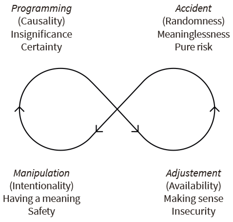
This study is about the semiotic value that emptiness may, somewhat paradoxically, acquire in marketing, and more precisely in advertising and product design. Our interest for this topic arises from a global example that originates from Japan — that of the MUJI firm, a corporate brand whose specificity is precisely to put “emptiness” to the forefront of their outdoor poster campaigns by simply showing vast empty landscapes. Such an approach strikingly contrasts with the kind of advertising that regularly shows on the walls of western cities, whose heavy tendency is on the contrary to lavishly occupy all the space available on the surface of their posters and display a maximum number of verbal and non verbal signs in order to loudly make their commercial messages come across. Saturation would be the technical term to describe this expressive mode of persuasion. From a semiotic standpoint, what can be said about these opposite advertising choices ? More broadly, what do they respectively mean ? In order to answer these questions, we will rely on Eric Landowski’s socio-semiotic theory, which basically articulates four regimes of interaction, meaning and risk, as summarised in the diagram below (Fig. 1). This semiotic model will serve us as a lens for the comparative analysis of the different types of advertising and marketing practices under consideration : |
* This article is a version, translated by the author and partly reshuffled, of J.-P. Petitimbert, “Amor vacui. Le design d’objets selon MUJI”, Actes Sémiotiques, 121, 2018. |
|
Fig. 1. The socio-semiotic interactional model: |
1 Adapted from E. Landowski, Les interactions risquées, Limoges, PULIM, 2005, p. 72. The relationships symbolised by the orientated ellipse that joins the four positions of the diagram are those defined by A.J. Greimas and J. Courtés in their semiotic dictionary, Semiotics and language. An Analytical Dictionary, Bloomington, Indiana University Press, 1983, pp. 359-361. |
In the first place, it is a truism to state that the type of advertising that we are used to is a highly manipulative enterprise. Indeed, the name of the game in marketing discourse is to influence the prospective consumers and to make them aspire to own the items that manufacturers produce and distribute on the market and promote in their advertising campaigns. Over the years, admen have developed a number of tools to achieve this goal. Among these, one of the most pivotal is the creative brief, also called the “copy-strategy” in the jargon of the profession, which is developped upstream of the process of producing a piece of advertising, in the back offices of the communication industry. This kind of document that presides over the generation of such campaigns is carefully thought out and meticulously designed on the basis of market analyses and brand audits. A copy-strategy basically is a specification form that is written for the attention of the creative department in charge of inventing and executing the corresponding campaign. It is composed of several pre-prepared boxes that must be filled by the strategist. It will typically start with the “objective”, that is with the formulation of the intention of the manipulator (or “sender), obviously to influence the market, their attitudes and behaviours. The next box is the “target audience”, which accommodates a definition or description of the recipient subject to be manipulated, i.e. the persona of the typical consumer that the campaign is supposed to attract and appeal to. It is followed by the description of the “insight” into the needs or wants of this stereotypical target consumer. This “consumer insight” is immediately followed by the advertising proposition, or “brand promise” : this commitment is the heart of the message and states the object of value to which the sender offers the subject to be conjoined. It is supposed to meet the needs or wants described in the “consumer insight” section and therefore be so desirable that it triggers its quest by the subject. Finally, the promise is substantiated by some sort of compelling argument or “supporting evidence”, also called “reason-why” or “reason-to-believe”, supposed to make the proposition credible, make the subject buy into the promise and start its quest. In standard semiotic narrative analysis, this full set of clauses could very well be described as a “contract. Having said that, on top of being Manipulators, advertising strategists can also be described as Operators, or more precisely Programmers. And indeed, those in charge of strategy in the advertising industry are called “strategic planners”. The main reason for this job title lies in the fact that their mission precisely consists in planning programs, that is to say sequences of effects that the advertising should cause amongst the target audience. They call this the “expected consumer response to the advertising”. |
|
|
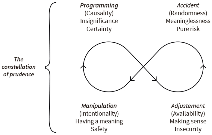
Therefore, as planned — so to speak — by the socio-semiotic interactional structure, such an overtly manipulative vision of advertising leads to envisage that it should conform to plans, i.e. comply with pre-prepared programs, or “algorithms”, composed of a row of linear causes and effects logically ensuing from one another. Most of these programmatic models are based on a trichotomy of steps (namely “Learn”, “Feel”, “Do”), respectively defining the cognitive, affective and behavioural changes expected to happen within the recipients as a consequence of being exposed to the advertising. Some agencies have even refined this conceptual equipment further by playing the three-card trick with the order in which the sequence of steps should happen, as they posit that there is no universally working hierarchy of effects model. Instead, the order of Learn, Feel and Do will depend on the type of purchase (either rational or emotional) and the level of involvement of the targets in the various product categories. For instance, paper towels trigger very low involvement, and are not very much linked to feelings. On the contrary, a sports car is a feeling product, and has a high involvement. So, they have come up with four different algorithms (either Learn-Feel-Do, or Feel-Learn-Do, etc.) and four corresponding types of advertising (informative, affective, and so on). From a socio-semiotic standpoint, we can say that the standard advertising practice — or, say, advertising as we know it — is firmly grounded in what the interactional theory describes as the “constellation of prudence”, since it is in essence both manipulative and programmatic (Fig. 2) : |
|
|
Fig. 2. The socio-semiotic interactional model : Having set the scene, we can now focus on our main topic, emptiness, as illustrated by the MUJI brand advertising campaign. MUJI is a thriving Japanese retail company, founded in the 1980’s, which sells a wide variety of household and consumer goods that they manufacture themselves. They started selling a short range of about fourty items and had no point of sale of their own at the time. Nowadays, they can claim to be a total lifestyle brand that offers clothing, homeware, cosmetics, furniture, kitchen appliances, tableware, food items, household care products, stationery, travel equipment, etc. Their products can be found in nine hundred stores under their banner around the world (in twenty nine countries) and their catalogue comprises more than seven thousand items. MUJI’s full name — Mujirushi Ry?hin — can be literally translated to “good products no label”, or in better English “unbranded quality goods”. But in spite of this “no label” ethos, MUJI has significant brand recognition among consumers and professionals. Having that in mind, we can have a look at their corporate advertising. We will mainly focus on their 2003 “Horizon” campaign, as examplified by the poster that appears when following the link below2. |
2 https://a-g-i.org/design/ |
|
This rather amazing poster is the kind of advertising that heavily contratsts with the classic billboards that we previously referred to. As one can see, there is precisely not much to see, to look at or “to read”, if we use Landowski’s terminology, that differentiates “reading” from “grasping” as two distinct ways to access to the significance of an object3. It is mainly composed of a very distant skyline, a vast empty spatial area or landscape, a solitary human being somewhere (allowing the beholder to get a flavour of the scale of the view) and a superimposed brand logo on top. And that’s it : No headline, no tagline, no product or pack shot. Conversely to the saturated clutters we can daily behold, this huge poster is in fact pretty empty ! It is indeed intended to represent emptiness. |
3 For more details on this distinction, see E. Landowski, “Une sémiotique à refaire ?”, Galáxia, São Paulo, 26, 2013, p. 24. http://revistas.pucsp.br/index.php/ |
|
Such a poster, along with many others in the same vein produced by MUJI over the years4, are quite reminiscent of, or even analogous to the most traditional Japanese visual art, the best example of which probably is the famous pair of screens painted by Hasegawa Tohaku in the XVIth century, that can be seen by following the link below5. It represents a pine forest covered in mist. |
4 Other examples at https://i.pinimg.com/originals/56/29/ |
|
In the general economy of the picture, the blank empty spaces are in fact much more important than those that are painted. They can be considered as a kind of visual device that is instumental in allowing the eye of the beholder to freely float around the trees and more importantly in triggering his imagination : they invite the recipent to guess and create what they hide. Where does this globally recognised Japanese artistic idiosyncrasy stem from? And what does it imply in semiotic terms, i.e. when it comes to what and how it signifies? One interesting explanation is given by Kenya Hara, MUJI’s art director, who is in charge of designing MUJI’s communication campaigns and who not only teaches design at Musashino Art University but also wrote several books about it6. He regularly shares his insight into the brand philosophy and explains where this concept of emptiness comes from in the form of lectures that he delivers all over the globe, generally to audiences composed of designers or future designers, in design schools or design departments of prestigious universities (e.g. UCLA), often on the occasion of the opening of a new store. |
6 See Kenya Hara, Designing design, Zürich, Lars Müller Libri, 2007, and also White, Zürich, Lars Müller Libri, 2009. |
|
According to him, emptiness has a long history and stems from the ancient Japanese religious beliefs and pratices of shinto. Shinto (or shintoism), as one knows, is an animistic religion whose origins date back long before the Chinese introduced buddhism into Japan (which only started in the 6th century AD). The ancient Japanese believed that wisdom is to be found in nature. They did not view it as wild but rather, in view of its abundant wealth, believed that it teaches human beings how to lead rich and wealthy lives accordingly. More importantly, they also believed that everything in nature, from trees and rocks, to rivers and mountains, is possessed by spirits (or “gods”), called kami. |
|
|
Because these kami, are invisible, it is hard to figure out where they are. The Japanese refer to them as Yaoyorozu no kami, which literally means eight million gods, that is to say myriads of gods. So, kami, or gods, are infinite and ubiquitous. But, according to shinto beliefs, nature being very fickle and delicate, there is no way to make an appointment with and visit these kami. The only thing that can be done is to invite them as guests. Therefore, they invented a curious type of structure, that is still common in Japan today. It is called shiro. It’s made of four pillars or poles arranged in a square, with their tops joined by a straw rope. Inside this area, there is nothing, it is empty. In fact, the whole device is emptiness made manifest. Once this structure is created, the kami, who see everything, cannot fail to notice this empty space, and one or two of them may come to fill it, because emptiness holds in itself the possibility of being filled. However, that does not give any certainty that any kami will enter. They may enter. This “may” carries great weight, because what people pray for is the possibility to interact with the deity, the possibility to be heard and the possibility to be fulfilled. People visit this type of shrine, and in its emptiness, they sense the potential presence of the deity, pray and then leave with a sense of having potentially communed with a god through this emptiness. To the shinto believer, that is good enough. This, according to Hara, is the origin of a certain kind of Japanese communication. Thus it seems that emptiness, considered as a potential receptacle for the divine and therefore as a condition for a possible interaction with it, has taken on its meaning and value in the Japanese culture and ethos. All in all, that is how this idiosyncratic amor vacui was born and has become recognisably imbedded in everything Japanese. It follows, according to K. Hara, that it is from this specific value bestowed to the vacuum by the Japanese shinto, viewed as a reserve of interactional potentialities, that this ethics of emptiness was adopted by MUJI since its creation. And indeed, MUJI communicates on emptiness, or rather conveys this very notion. Its advertising does not try to sing the praise of anything in particular. It carries no specific message, no precise content. Not even about the MUJI brand itself. The brand litterally has no strategy stricto sensu. It is not based on a “creative brief” (with an objective, a target, a promise, a reason-to-believe, as described above), it does not propose any contract and does not try to trigger any particular algorithm or pre-planned sequence of consumer responses. So, how does this unusual communication operate ? What is its mechanism ? |
|
|
Obviously, this type of advertising resists the standard narrative decription. It showcases no product (or object of value), and there is thus no Sender-Manipulator to semanticize it (that is to give it its value) and make the recipient-subject want it and seek it, by relying on the implementation of a pre-established regular sequence of effects. Unlike the standard advertising practice, MUJI’s campaigns are therefore not grounded in the principles of intentionality (Manipulation) or causality (Programming), but rather on the principle of availability. The mecha- nism consists in harnessing the potential of each interactant (the brand advert and its audience). It appeals to the sensibility of the response given by recipients to the sensible features of the advert. In other words, because it is not designed to manipulate its beholders or make them comply with a pre-planned program, it is legitimate to state that this kind of advertising counts on the regime of Adjustment, whereby the meaning of the campaign is literally produced and grasped (but not “read”) in the interaction itself. In K. Hara’s own words, MUJI advertising is designed to be a “creative receptacle”, and he often describes it as an “empty vessel”, ready to be filled, that is capable of accommodating whatever the beholder’s mind will come up with : its emptiness makes it a container, available for the content that will result from its interaction with the recipients. That is to say that, on the one hand, the advertising has the potential to trigger its beholders to draw on their potential creative resources to make sense of whatever each of them feels MUJI to be. And, on the other hand, because the ad is a receptacle, it equally has the potential to accommodate the outcome of this process. As a matter of fact, according to Hara, the success of a MUJI campaign is not measured by the correct reception of a message by the recipents, but rather by its ability to conjure up a multiplicity of images in their minds. The advertising value of this visual emptiness is that the vacant spaces displayed on the posters offer an endless potential of receptive capacity. This understanding of the concept of emptiness makes it a stance — a readiness to receive inspiration and input from outside. Advertising this way is analogous to posing one single question to as many people as possible and to be wholly ready to accept the huge variety of answers from them. One cannot help thinking here of the analyses of enunciation carried out in a whole other field — that of the biblical texts — by Louis Panier and the CADIR semiotic research group7. Their works make the hypothesis that the enunciation is sometimes identified through figures which, emptied of their thematic content, no longer function as “signs” but as signifiers left to the discretion of the enunciatee, almost un-interpretable or, at least, “available for other, unexpected, semantic investments”8. Greimas himself had noted this peculiarity in his work on evangelical parables. He drew the conclusion that the peculiarity of this type of text was “the transfer of responsibility to the enunciatee, the receiving subject of the message, to whom it is incumbent to interpret it, to choose the ‘right answer’”9. |
7 CADIR : Centre pour l’Analyse du Discours Religieux, publisher of the journal Sémiotique et Bible since 1975. 8 L. Panier, “Sens, excès de sens, négation du sens”, Nouveaux Actes Sémiotiques, 114, 2011 https://www.unilim.fr/actes-semiotiques/2587. (Our translation). 9 A.J. Greimas, “La parabole : une forme de vie”, in L. Panier (ed.), Le temps de la lecture. Exégèse biblique et sémiotique, Paris, Cerf, 1993. (Our translation ; the stress and quotation marks are in the original text). |
|
And as a matter of fact, in his talks Hara often states that some people will view Muji as the standard bearer of a better, simpler way of life or will associate the brand with naturalness. Others will adhere to its poetic refinement, or will even believe that it represents the quintessence of Japanese minimalistic design. Some will believe that it is a responsible brand that is ecologically friendly and contributes to saving global resources. Lastly, others will just find it economical because they view it as a rationally low priced brand with a purely functional approach to products. However, conversely to standard advertisers who rely on the measures of such elements of image to create messages designed to steer their brand into a given direction, MUJI’s communication uses none of these images or perceptions. Having generated them, the brand is also receptive to all. But of course, by being so quiet, so empty, MUJI do put themselves in danger. With the regime of Adjustment that they choose to implement, nothing is safe (unlike the regime of Manipulation), nothing is certain or sure in terms of consumer response to the communication (as opposed to the regime of Programming). There is a high level of uncertainty attached to the regime of Adjustment. It inevitably leads MUJI to run a major risk, that of falling into its neighbouring regime, the hazardous regime of Accident, under the auspices of randomness. This is precisely one of the characteritics that define Adjustment in the socio-semiotic theory. Adjustment as a regime of interaction and significance leading to the creation of unprecedented sense necessarily entails to embark on its corresponding regime of risk, that Landowski labels “insecurity”, and that we, in the context of other analyses, labelled “precariousness”10. Just as he litterally puts it, Adjustment is indeed a regime of interaction “where the ‘best’ can only be achieved by responsibly taking the risk of the ‘worst’ and where the mutual fulfillment of both partners borders the accident”11. This kind of advertising takes a big risk from a marketer’s point of view : that of misunderstanding, or even worse, the risk of perplexity, that is of triggering no understanding at all, leaving beholders disconcerted and unable to precisely “make sense” of what they are looking at. In that instance, the empty vessel would accommodate only bewildered questions marks. And these disorientated question marks could obviously be quicky replaced by negative remarks. This kind of advertising may lead beholders to think of MUJI as a puzzling or even esoteric brand, sending far-fetched, obscure, or incomprehensible messages. This is not only a danger in terms of brand image, but also, given the size of the communication budgets, a high financial hazard, meaning money possibly unwisely spent on counterproductive advertising (a mortal sin in our neo-liberal economies !). |
10 J.-P. Petitimbert, “Entre l’ordre et le chaos. La précarité comme stratégie d’entreprise”, Actes sémiotiques, 116, 2013 https://www.unilim.fr/actes-semiotiques/1437. 11 E. Landowski, “A? quoi sert la construction de concepts ?”, Actes Se?miotiques, 117, 2014 https://www.unilim.fr/actes-semiotiques/5054#dialogue2. (Our translation). |
|
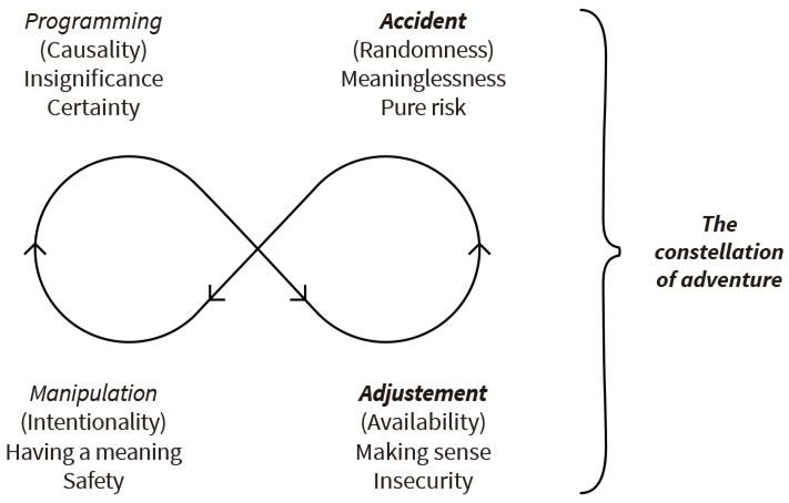
Falling into the regime of Accident means that the communication may well eventuate as meaningless to (some of) its recipients. This necessarily implies that despite the brand’s efforts to embrace as many people as possible, this policy inevitably leads to segment consumers and divide them into two types : on the one hand, those who like to be helped, directed or guided and be told what to understand (and who are precisely those likely to be puzzled or disconcerted by this type of advertising) ; on the other hand, those who are more free-spirited, more independent, and like to apprehend things by themselves (and who, on the contrary, are likely to enjoy and happily adhere to this type of unusual advertising). We will come back to this dichotomy further, in our conclusion. By responsibly taking this randomness and hazard into account, MUJI is prepared to be endangered and give its assent to whatever happens as a result in this unusual communication process. Therefore we can state that its advertising encompasses both regimes of Adjustment and Accident, which is what Landowski describes as the “constellation of adventure” (Fig. 3), where the world of significance is much less stable and reassuring than in the other constellation, as it is not founded on immutable laws of causality, on contracts or instructions that simply need to be followed to the letter. And indeed, it is probably not exaggerated to state that MUJI is somewhat of an “adventurous” brand. |
|
|
Fig.3. The socio-semiotic interactional model : For MUJI, this regime of Adjustment not only applies to advertising, but also to product design. In his talks, K. Hara often gives an enlightening example of what emptiness means in product terms. His demonstration compares the handles of two kitchen knives side by side : one is a Henckels knife from Germany, the other is a Japanese traditional yanagiba sushi knife. The asymmetrical, curved and ribbed shape of the handle of the Henckels knife is ergonomically designed, so that when a hand grabs it, the fingers and the thumb naturally find their places. Its high level of what ergonomists call “affordance” makes it a simple tool that is very easy to hold and use. The object is carefully thought out and designed to instruct the user what to do. Conversely, the handle of the yanagiba is a mere smooth and flat wooden cylinder. As a consequence, the shape of the Japanese handle doesn’t instruct users where to hold it, so that they can hold it anywhere, and in any way they wish. This plain unadorned handle can accommodate the wide variety of techniques of the Japanese sushi chefs. |
|
|
At the end of the day, this concept of emptiness applied to product design is a manifesto, a clear treatise against over-engineered objects. The German knife is meant to be simple insofar as it is ergonomically designed to fit the palm and fingers of the cook, to anticipate the user’s grip, giving the thumb a natural place to rest, etc. But the Japanese chefs prefer a less programmed tool, in order to feel free to hold it as they please. The yanagiba fits not so much the hand of the cook as his skill. In that sense, the yanagiba is an empty object. In K. Hara’s own words : A flat handle is not seen as raw or poorly crafted. On the contrary, its perfect plainness is meant to say, “You can use me whichever way suits your skills.” The Japanese knife accommodates the cook’s skill, not the cook’s thumb. (…) When an object is empty, it is ready to receive any image or use. (…) Emptiness is the pursuit of ultimate freedom. Socio-semiotically speaking, this is what we can make of this comparison : Both can be considered as beautiful objects and wonderful knives, but, from an interactional standpoint, there is a clearcut difference. One falls into the regime of Programming whereby you just need to follow the instructions, the other into that of Adjustment, whereby you have to invent your own way to hold it. K. Hara’s example of cooking knives is highly reminiscent of Jean-Marie Floch’s brillant analysis of the difference between two types of multitask folding knives : the Swiss Army knife (for engineers) and the Opinel knife (for bricoleurs)12. They contrast in exactly the same way as the Henckels and the yanagiba knives. This is what Landowski wrote about J.-M. Floch’s analysis of the two knives, in his article “Avoir prise, donner prise” : As he [JMF] proceeds in the analysis of the two types of operations — those carried out respectively by a “bricoleur”, with an Opinel, and an “engineer”, with a Swiss knife — the interpretation that he proposes goes in a direction that is increasingly close to what we, a few years later, defined in terms of Adjustment on the one hand, and in terms of Programming and operations, on the other.13 |
12 J.-M. Floch, “Opinel — intelligence at knifepoint”, Visual identities, London, Continuum, 2000. 13 E. Landowski, “Avoir prise, donner prise”, Actes Se?miotiques, 112, 2009, section II.1.3 https://www.unilim.fr/actes-semiotiques/2852. (Our translation). |
|
He then continues, quoting the original French version of Floch’s article14 : With regard to the Swiss knife, it is only a question of “automated action programs” where the user “only provides effective energy” through “frozen gestural syntagms”. With regard to the Opinel, an instrument “conducive to the expression and realization of self”, Floch shows how it involves “the closest possible contact with the sensible world” and gives the user the opportunity to “experience an æsthetic emotion (or allow it to be experienced)”. It is no longer a matter of trust [fiducie], mandate, delegation or manipulation ! but either (with the Swiss knife) of exploitable regularities, or (with the Opinel) of sensibilities in contact. In the latter case, the utilitarian function, while being fulfilled, is exceeded in a performance which tends towards a form of æsthetic accomplishment, thanks to the adequacy of the relationship that it assumes between the object and the one who practices it. — This, even with an instrument as common as a knife !15 |
14 J.-M. Floch, “Le couteau du bricoleur. L’intelligence au bout de l’Opinel”, Identités visuelles, Paris, P.U.F., 1995. 15 E. Landowski, “Avoir prise, donner prise”, art. cit. |
|
These comparisons and differences are in direct connection with Landow- ski’s distinction between two generic forms of use of objects : either utilise them or practice them16. This leads to distinguishing two schools or two “philosophies” of design17. The most traditional one posits that the designer’s job is to come up with objects whose features have been optimised in order to increase their affordance and make the user’s life simpler. These we can call “useable” objects, or “closed-ended”, easy-to-use objects. Another design school, notably represented by K. Hara, posits that the designer’s task is on the contrary to come up with “open-ended” undetermined objects (let us call them empty), in other words, objects whose purpose remains as minimal as possible so that the user feels himself free to creatively invent his own way to make use of them and can even go so far as to make them deliver more than what they were intended for. |
16 His definitions can be found in “Voiture et peinture : de l’utilisation a? la pratique”, Gala?xia, XII, 2, 2012, http://revistas.pucsp.br/index.php/galaxia/ 17 For further considerations on that matter, see Murilo Scoz, “Por uma sociossemiótica do design de interação”, Actes Sémiotiques, 121, 2018 https://www.unilim.fr/actes-semiotiques/6075. |
|
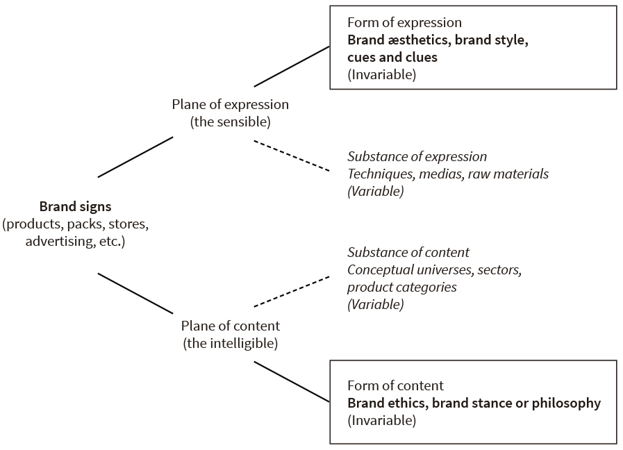
In order to further explain what the latter vision of the designer’s mission implies, K. Hara has invented a word : “ex-formation”. This neologism designates the opposite of the operations of information, which define the traditional task of the designer who seeks to achieve affordance in the objects that he designs. Let us dwell a moment on this notion. “Ex-forming” an object entails to streamline it and get rid of any “frills” or extras that more traditional designers could be tempted to include in it. It is a careful process of elimination and subtraction of the gratuitous features unrelated to the basic and elementary function of the object. It means aspiring to achieve modest and plain objects that end up as free of agenda and instructions as possible. According to K. Hara, quoting his predecessor at MUJI Ikko Tanaka, a designer should be firmly confident in this process as its outcome is “in no way inferior to splendor”, and can even largely “surpass splendor”. That said, the ope- rations of ex-formation have a limit that the designer cannot cross, that which would constitute the nonsense, that is to say going so far as to make the object unrecognisable and unknowable. Even if K. Hara uses the phrase “make things unknown” to describe these operations, this does not mean that ex-formation pursues the unintelligible. From a Platonist perspective, this entails to produce the non-verbal manifestation of the (generic) idea of the object — no less, no more. In semiotic terms, it is for the designer to produce an object whose confi- gurative, taxic and functional description — according to the three components which, for Greimas, determine all objects — can only be reduced to the smallest irreducible set of elementary features which constitute the minimal definition of the class to which it belongs18. 3. Going further: ethics and æsthetics In the context of his brand analyses, J.-M. Floch often harnessed and adapted Hjelmslev’s definition of signs with its two planes (inherited from Saussure), the plane of expression and that of content, but above all its two strata per plane : the stratum of the variable substances, and the stratum of the invariable forms (Fig. 4.)19 : |
18 A.J. Greimas, “Un problème de sémiotique narrative : les objets de valeur”, Langages, 31, 1973 (reed. in Du sens II, Paris, Seuil, 1983). 19 See J.-M. Floch, “Logiques de persuasion du consommateur et logiques de fidélisation du client”, in AAVV, Comment parler au consommateur aujourd’hui et demain ?, Cahiers de l’IREP, 1998, pp. 41-56. |
|
Fig. 4. Helmslev’s description of signs, adapted to brand analyses by J.-M. Floch. Floch would define the substance of content of a brand as consisting of the conceptual universes in which it operates. In other words, this substance of content covers the business sectors, the product categories, the markets or market segments in which the brand manifests itself. As for the substance of expression of a brand, it refers to the techniques, media or materials processed and wrought by a given brand to manufacture its manifestations. |
|
|
To Floch, the form of content of a brand is the level which accommodates the way the brand considers and positions itself with regard to the conceptual universes in which it operates. It is where brands assert their way of structuring their environment as a whole. It is where they define their differences from their competitors. This is also where the singularity of any brand lies, where its “philosophy”, its “Weltanshauung” (worldview) or its relationship to others, competitors and consumers alike, are deposited. It is this stratum that Floch ended up calling the “brand ethics” and that is, in a way, the hard core of the brand, its “stance”. The brand ethics gathers the conditions for a brand to be loyal to itself. Let us remind that the notion of “ethics (derived from ethos, i.e. mores), is defined as the way of organizing one’s conduct by tending towards the realization of the values that one gives oneself. While morality is ‘exogenous’ (in the order of duty), ethics is ‘endogenous’ (in the order of personal willpower)”20. |
20 Id. and E. Roux, “Gérer l’ingérable : la contradiction interne de toute maison de luxe”, Décisions Marketing, 9, 1995, p. 20 (our translation). |
|
As for the form of expression, it is the perceptible level where the specific sensory characteristics of a given brand are located and translate into a unique style (what marketers will simplistically refer to as the brand cues and identity clues). Depending on the languages used by the brand, be they verbal or non verbal (e. g. visual), these characteristics may be of various natures : rhythmic, melodic, prosodic, etc. They will be applied to whichever substances of expression will be chosen and processed by the brand to manifest itself. They will “mark” its productions, endow them with a unique hand or touch, with an inimitable and unmistakable craftsmanship. Floch labelled this stratum as the “brand æsthetics”. The brand æsthetics gathers the conditions for a brand to be recognised, æsthetics being conceived here as “an approach to the world of the sensible, that is to say of the senses, involving a ‘worldview’ and a certain relation of oneself to the world [i.e. the pre-defined form of content], capable of communicating an emotion”21. Therefore, for Floch, the essence of a brand is both a “stance” and a “style”, or in other words the articulation of an “ethics” with an “æsthetics”, both planes being by definition united22. |
21 Ibid., p. 21 (our stress, our brackets). 22 Floch’s definition of a brand, mostly exposed in his book Visual identities, was highly inspired by the notions developed by Paul Ricœur, the French philosopher, in several of his works (particularly in Soi-même comme un autre) about the concept of “narrative identity”. A narrative identity is to be found at the crossroads of what the philosopher defines as one’s “truth towards others” (parole tenue), and what he calls one’s “character” (caractère), each of these being the resultant of a dialectic between two inner forces, ipse and idem, where one overrides the other alternatively. Cf. J.-M. Floch, “Waterman and its doubles”, Visual identities, op. cit., and P. Ricœur, Soi-même comme un autre, Paris, Seuil, 1990. |
|
That said, when it comes to MUJI, if we apply Floch’s model, we can easily state that MUJI’s ethics can be summarised by the notion or philosophy of “Emptiness”, considered as a reservoir of potentials as we saw it, insofar as MUJI places this concept at the heart not only of its design practice, but also of its relationship and interaction with its consumers and recipients. Symetrically, we can also state that MUJI’s æsthetics is characterised by the art of “Ex-formation”, that is the skill to carefully eliminate what is unnecessary from whatever the brand embarks on, be it product, pack, advertising, etc. The above conclusion can easily be substantiated by proceeding to a closer analysis of one of MUJI’s posters (Fig. 5). |
|
|
Fig. 5. MUJI’s æsthetics and ethics: 2003 advertising campaign The techniques, medias, raw materials that compose its substance of expression are obvious: a two dimensional space, photography, layout, words, typography and print techniques. The conceptual universes in which MUJI operates and that compose its substance of content are not only composed of MUJI’s direct and indirect competitors, retailers and power brands, but also of the world of advertising as a whole. These substances are then taken charge of by the forms : the ex-formation of the substances of expression results in a pared-down æsthetic style with no copy, no proposition, no message, no tagline, no product shot and as little information as possible (i.e. the minimal set of features that allow to grasp it as an advertising poster). This approach is the perceptible twin of MUJI’s conceptual stance (or philosophy) of emptiness, according to which it is up to the beholder to invent what MUJI means and stands for, and, in other words, to fill this empty vessel. Finally, emptiness is about making space for the potential of the reciever’s creative imagination to flourish. And as K. Hara puts it, in this poster as well as in all of MUJI’s productions “there is nothing, and yet there is everything”. |
|
|
This analysis of MUJI’s corporate campaign is also applicable to their product advertising. K. Hara’s considerate attention to the brand essence (its ethics and æsthetics) is the main reason why he also develops very silent product campaigns, simply showing beautiful shots of the products, either in close up or staged in empty landscapes, reminiscent of the corporate communication. None of the product ads gives any specific information, they show products in a way that leaves full flexibility to the recipients to determine how they want to use them (a piece of furniture may turn into a bookshelf, a bathroom or garage storage unit, a display case, a garderobe, etc.). They all give their recipients the freedom to develop their own way to assign a function to the objects and eventually to mutually adjust to one another in a way which fully exploits their respective potentials. This is how emptiness works in advertising : open-ended visuals that wake beholders to this emptiness and trigger their imagination or creativity. And in their stores, instead of naming a product with its intended purpose or use — like, “coffee table”, “dinner table”, “kitchen table” or “bed side table” — MUJI prefer neutral open-ended definitions such as “oak table”. This gives clients the creative freedom to designate the ultimate purpose of the table by themselves. 4. Ways of doing — ways of being What precedes permits to state that the approach chosen by MUJI to design, market and promote the objects that they manufacture introduces a shift in the ageing world of standard marketing practice : a rejuvenating change of paradigm. The old marketing paradigm has been so far carefully steered by anxious marketers whose obsession about limiting risks led them to seek the safety of manipulative strategies, that is strategies stricto sensu, whereby potential customers, supposed to have “expectations, needs and wants”, are made to aspire to acquire and utilise products, whose values rest in their capacities to meet the consumers’ assumed needs and make their lives simpler. Increased competition, obeying the same logic and founding their propositions on the same so called needs, also led them to develop products with a superiority, a “plus”, a stronger “affordance” (that is more in-formation and more instructions) in a never ending race where every brand strives to outdistance its adversaries on the same battleground with the same rules. Along the same line, their advertising agencies have developed sharper and sharper communication tools and have come up with mechanistic models and programs so as to make sure to automatically meet their clients’ goals with a view to being as efficient as possible. |
|
|
Although MUJI plays the game, they have infringed the rules and chosen another battleground, so to speak. They are not in search of safety and certainty. They cultivate a sense of insecurity that borders hazard. This adventurism translates in the fact that they do not rely on assumptions about their consumers’ needs or wants, but rather rely on the potential, availability and sensibility that each of them has. As we saw, this means that they do not look for any “superiority” in their products, any greater “affordance”. On the contrary, they prefer less programmed products, free of agenda and instructions. “Ex-formation” allows them to come up with “empty”, practicable products that are “open-ended” and therefore allow their users to develop their own way to make use and sense of them. This is what we analysed in terms of Adjustment. This very same approach has led them to develop an “open-ended”, “empty” type of communication whose content and meaning is also to be invented by its recipients who are invited to make sense of it by themselves. Advertising, conceived as an “empty vessel”, can accommodate as many interpretations as possible, including question marks and perplexed responses. In that sense it may fall into the hazardous regime of Accident. With this new paradigm, is it still question of choosing between more or less pre-programmed objects, or does the nature of the choice itself change ? The assumption that can be made is that this conception of marketing introduced by MUJI in the general economy of brands cannot be reduced to a mere proposition of new objects “in addition”, i. e. extra products on top of those already out there. But it can rather be understood as a way of doing, and thereby, a way of being with and through these objects, or even beyond, as a way to “live”, to “experience” them, by practicing them. What this broadening of paradigm therefore allows is the possibility of a “meta-choice” (a notion proposed by Landowski in Passions sans nom23) whereby instead of choosing things, one chooses oneself a self. According to Landowski, when it comes to making choices, the subject can rely on two elementary options. First, he may “listen to what others say, to what the uses, norms, opinions, tastes prevailing around him tell him” ; the task of designating what he does or should like is then delegated to the “Other” ; his identity and status therefore have an exogenous origin. Or he can “search for himself and by himself what the objects of his desire are, and trust his own experience and feelings, in the direct presence of the sensitive qualities of the external world, through the proprioceptive apprehension that his own senses allow”. His identity and status in this case have an endogenous origin. |
23 “Le goût des gens, le goût des choses”, Passions sans nom, Paris, P.U.F., 2004. More recently, “Pour une sémiotique du goût”, Actes Sémiotiques, 122, 2019, section 3.3.2 https://www.unilim.fr/actes-semiotiques/6237. |
|
It is not difficult to see to what respectively corresponds, in the present context, each of these two selves that one can choose for oneself. In the standard brands’ camp (the constellation of prudence), we find the figure of the programmer, whose plans have been anticipated by smart and shrewd marketers and designers, and who has to conform to the “affordance” of the objects that have been thought out in his stead, and thereby finds himself “programmed” in his turn. Choosing such brands and being loyal to them is somehow equivalent to swearing allegiance to them, acknowledging them with a transcendant authority that they impose all the more easily as they do not need to use force to do so. The definition of the ancient Roman cliens, in his freely consented relation of subjection and fidelity to the auctoritas of the noble benefactor, fully corresponds to this type of subject. Choosing this option for oneself amounts to defining oneself as a “client”, in the most litteral, original and etymological sense of the term. In the other camp, where MUJI sits (the constellation of adventure), we find the figure of the “amateur” (or the “poacher”, to use Michel de Certeau’s terminology24), who denies any form of authority (and therefore is the antithesis of the cliens). The amateur is a free-spirited improviser who, as a poacher, trespasses the fences of corporate territories and who, as a maverick, has a liking for transgressing rules. He never takes things at face value but interprets, or rather re-interprets them in his own way. He is somewhat of a resistant fighter against the system. To him, any merchandise can be somehow turned into something that it was not intended for. The amateur is also a pleasure seeker who, as Benoît Heilbrunn, a famous French professor of Marketing, puts it, “in his quest of singular sensory encounters, takes the path less travelled and for whom it’s all about tackling the world head on to make it less insignificant and get rid of the insipidity that inexorably lies in wait for it”25. Conversely to the programmer who is happy to be influenced and dictated what to do (and be), the amateur is a loose cannon. His open-mindedness, intrinsic sensibility and permanent availability can happily accommodate such undetermined or “empty” objects as MUJI’s products or advertising that impose nothing but, because they apparently have no precise usage or meaning, are therefore available for many, including and especially those of his own invention. |
24 M. de Certeau, L’invention du quotidien. 1 : Arts de faire, Paris, Gallimard,1990. (The French term he uses is braconnier or braconnage). 25 B. Heilbrunn, “Retour de l’amateur”, in Médi(t)ations marchandes, Lormont, Le bord de l’eau, 2018, p. 45. |
|
It is fair to say that MUJI’s approach somehow teaches marketers a good lesson. Despite its declared “no label” ethos, through its philosophy of “emptiness”, MUJI behaves as a true brand worthy of the name. If markets today are more and more saturated with products that are more and more undifferentiated and, as a consequence, more and more insignificant, is it not because “standard” brands have been sleeping on their laurels and have fallen into some routine of thought, like conforming to unquestioned ways of working, merely repeating “proven successful” recipes, harnessing unimaginative consumer research methods, or blindly sticking to “established wisdom”…? |
|
|
We would like to briefly conclude with another quotation from the above mentioned specialist in brand management : according to Benoît Heilbrunn, a brand worthy of the name should not be reduced to a mere prose of production. It should rather be considered from the angle of a poetics of creation, considering that creating has nothing to do with producing. A brand mission should be about creating possibilities, about liberating possibilities of life capable of increasing both our power of sensitivity and our enjoyment of living. This is why a brand should absorb us in the order of life and not in that of representation. Is it not this æsthetic / ethical awakening of brands that could constitute a possible last defence against the lurking disenchantment of our industrial economies ?26 Is this not precisely what MUJI has already been doing for some time now, and in a rather admirable exemplary way ? |
26 Id., “Ré-jouir : Pour une esth/éthique de la marque”, Rue Descartes, 91, 2017, p. 148 (our translation, our stress). |
|
References Certeau, Michel de, L’invention du quotidien, 1, Arts de faire, Paris, Gallimard,1990. Floch, Jean-Marie, Identités visuelles, Paris, P.U.F., 1995. Engl. transl., Visual identities, London, Continuum, 2000. — and Elyette Roux, “Gérer l’ingérable, la contradiction interne de toute maison de luxe”, Décisions Marketing, 9, 1996. — “Logiques de persuasion du consommateur et logiques de fidélisation du client”, in AAVV, Comment parler au consommateur aujourd’hui et demain ?, Cahiers de l’IREP, 1998. Greimas, Algirdas J., “Un problème de sémiotique narrative : les objets de valeur”, Langages, 31, 1973 (reed. in Du sens II, Paris, Seuil, 1983). — “La parabole : une forme de vie”, in L. Panier (éd.), Le temps de la lecture. Exégèse biblique et sémiotique, Paris, Cerf, 1993. — and Joseph Courtés, Semiotics and language. An Analytical Dictionary, Bloomington, Indiana University Press, 1983. Hara, Kenya, Designing design, Zürich, Lars Müller Libri, 2007. — White, Zürich, Lars Müller Libri, 2009. — Ex-formation, Zürich, Lars Müller Libri, 2015. Heilbrunn, Benoît, “Ré-jouir : Pour une esth/éthique de la marque”, Rue Descartes, 91, 2017. — Médi(t)ations marchandes, III, “Retour de l’amateur”, Lormont, Le bord de l’eau, 2018. Landowski, Eric, Passions sans nom, Paris, P.U.F., 2004. — Les interactions risquées, Limoges, PULIM, 2005. — “Ajustements stratégiques”, Nouveaux Actes Sémiotiques, 110, 2007. — “Avoir prise, donner prise”, Actes Sémiotiques, 112, 2009 https://www.unilim.fr/actes-semiotiques/2852. |
|
|
— “Voiture et peinture : de l’utilisation à la pratique”, Galáxia, 24, 2012 http://revistas.pucsp.br/index.php/galaxia/article/view/12945. — “Une sémiotique à refaire ?”, Galáxia, São Paulo, 26, 2013. — “A? quoi sert la construction de concepts ?”, Actes Se?miotiques, 117, 2014. — “Pour une sémiotique du goût”, Actes Sémiotiques, 122, 2019 https://www.unilim.fr/actes-semiotiques/6237. Panier, Louis, “Sens, excès de sens, négation du sens”, Nouveaux Actes Sémiotiques, 114, 2011 https://www.unilim.fr/actes-semiotiques/2587. Petitimbert, Jean-Paul, “Entre l’ordre et le chaos. La précarité comme stratégie d’entreprise”, Actes sémiotiques, 116, 2013 https://www.unilim.fr/actes-semiotiques/1437. Ricœur, Paul, Soi-même comme un autre, Paris, Seuil, 1990. Scoz, Murilo, “Por uma sociossemiótica do design de interação”, Actes Sémiotiques, 121, 2018. |
|
* This article is a version, translated by the author and partly reshuffled, of J.-P. Petitimbert, “Amor vacui. Le design d’objets selon MUJI”, Actes Sémiotiques, 121, 2018. 1 Adapted from E. Landowski, Les interactions risquées, Limoges, PULIM, 2005, p. 72. The relationships symbolised by the orientated ellipse that joins the four positions of the diagram are those defined by A.J. Greimas and J. Courtés in their semiotic dictionary, Semiotics and language. An Analytical Dictionary, Bloomington, Indiana University Press, 1983, pp. 359-361. 3For more details on this distinction, see E. Landowski, “Une sémiotique à refaire ?”, Galáxia, São Paulo, 26, 2013, p. 24. http://revistas.pucsp.br/index.php/galaxia/article/view/16837/1301226. 4 Other examples at https://i.pinimg.com/originals/56/29/d9/5629d917baa542d16be08ee7fd6d5252.jpg. 6 See Kenya Hara, Designing design, Zürich, Lars Müller Libri, 2007, and also White, Zürich, Lars Müller Libri, 2009. 7 CADIR : Centre pour l’Analyse du Discours Religieux, publisher of the journal Sémiotique et Bible since 1975. 8L. Panier, “Sens, excès de sens, négation du sens”, Nouveaux Actes Sémiotiques, 114, 2011 https://www.unilim.fr/actes-semiotiques/2587. (Our translation). 9A.J. Greimas, “La parabole : une forme de vie”, in L. Panier (ed.), Le temps de la lecture. Exégèse biblique et sémiotique, Paris, Cerf, 1993. (Our translation ; the stress and quotation marks are in the original text). 10J.-P. Petitimbert, “Entre l’ordre et le chaos. La précarité comme stratégie d’entreprise”, Actes sémiotiques, 116, 2013 https://www.unilim.fr/actes-semiotiques/1437. 11 E. Landowski, “A? quoi sert la construction de concepts ?”, Actes Se?miotiques, 117, 2014 https://www.unilim.fr/actes-semiotiques/5054#dialogue2. (Our translation). 12J.-M. Floch, “Opinel — intelligence at knifepoint”, Visual identities, London, Continuum, 2000. 13E. Landowski, “Avoir prise, donner prise”, Actes Se?miotiques, 112, 2009, section II.1.3 https://www.unilim.fr/actes-semiotiques/2852. (Our translation). 14 J.-M. Floch, “Le couteau du bricoleur. L’intelligence au bout de l’Opinel”, Identités visuelles, Paris, P.U.F., 1995. 15 E. Landowski, “Avoir prise, donner prise”, art. cit. 16 His definitions can be found in “Voiture et peinture : de l’utilisation a? la pratique”, Gala?xia, XII, 2, 2012, http://revistas.pucsp.br/index.php/galaxia/article/view/12945. 17For further considerations on that matter, see Murilo Scoz, “Por uma sociossemiótica do design de interação”, Actes Sémiotiques, 121, 2018 https://www.unilim.fr/actes-semiotiques/6075. 18 A.J. Greimas, “Un problème de sémiotique narrative : les objets de valeur”, Langages, 31, 1973 (reed. in Du sens II, Paris, Seuil, 1983). 19 See J.-M. Floch, “Logiques de persuasion du consommateur et logiques de fidélisation du client”, in AAVV, Comment parler au consommateur aujourd’hui et demain ?, Cahiers de l’IREP, 1998, pp. 41-56. 20 Id. and E. Roux, “Gérer l’ingérable : la contradiction interne de toute maison de luxe”, Décisions Marketing, 9, 1995, p. 20 (our translation). 21 Ibid., p. 21 (our stress, our brackets). 22 Floch’s definition of a brand, mostly exposed in his book Visual identities, was highly inspired by the notions developed by Paul Ricœur, the French philosopher, in several of his works (particularly in Soi-même comme un autre) about the concept of “narrative identity”. A narrative identity is to be found at the crossroads of what the philosopher defines as one’s “truth towards others” (parole tenue), and what he calls one’s “character” (caractère), each of these being the resultant of a dialectic between two inner forces, ipse and idem, where one overrides the other alternatively. Cf. J.-M. Floch, “Waterman and its doubles”, Visual identities, op. cit., and P. Ricœur, Soi-même comme un autre, Paris, Seuil, 1990. 23 “Le goût des gens, le goût des choses”, Passions sans nom, Paris, P.U.F., 2004. More recently, “Pour une sémiotique du goût”, Actes Sémiotiques, 122, 2019, section 3.3.2 https://www.unilim.fr/actes-semiotiques/6237. 24 M. de Certeau, L’invention du quotidien. 1 : Arts de faire, Paris, Gallimard,1990. (The French term he uses is braconnier or braconnage). 25 B. Heilbrunn, “Retour de l’amateur”, in Médi(t)ations marchandes, Lormont, Le bord de l’eau, 2018, p. 45. 26 Id., “Ré-jouir : Pour une esth/éthique de la marque”, Rue Descartes, 91, 2017, p. 148 (our translation, our stress). |
|
______________ Key words : adjustment, advertising, æsthetics, brand, design, emptiness, ethics, practice vs use, socio-semiotics. Mots clefs : ajustement, design, esthétique, éthique, marketing, marque, pratique vs utilisation, publicité, socio-sémiotique, vacuité. Authors cited : Michel de Certeau, Jean-Maris Floch, Algirdas J. Greimas, Kenya Hara, Benoît Heilbrunn, Eric Landowski, Louis Panier, Paul Ricœur. Plan : 3. Going further : ethics and æsthetics |